Howdy!
Yesterday I went for a stroll in the neighborhood. I went with Lauren Wagner who graciously took the pictures. We went looking for the stuff that
ATSA had done in order to "attract" tourists to the
neighborhood. I figured that it would give me a chance to comment on them.
First off, there doesn't seem to be any rhyme or reason to what where or how. Most (but not all) of the posters are the same size. Some places where you think there should be posters there aren't, some places where there shouldn't be a poster, there is. And then finally - the disclaimer, I wasn't able to get all of them, I know of at least three that I missed due to oversight.

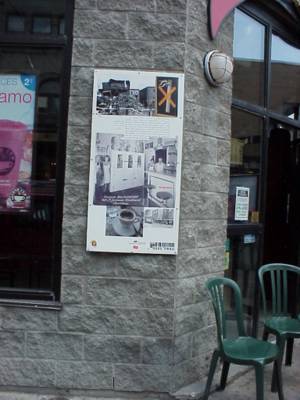
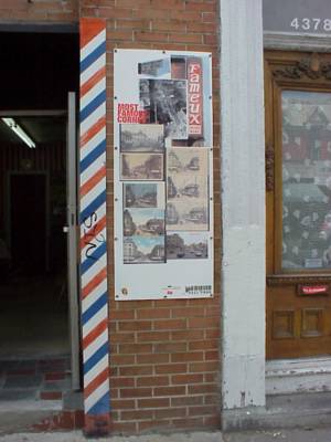
Right besides Warshaw's, there's a poster about Smoked Meat. Hmmm. There previously had been a whack of old pictures of Warshaw's up there while they were building the Pharmaprix that now occupies the space, why the disconnect?

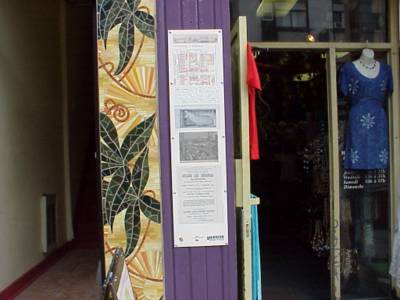
This one is in between the Hungarian deli and a clothing store (who's name I don't know 'cuz I don't buy clothes) and it makes no sense at all to me within that context. Given the overtly "historical" nature of the pieces I think that each one should have been made place specific. Not just slapped up on a wall to make you
scratch your chin.

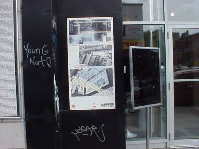
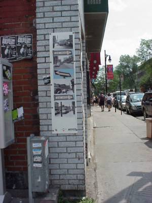
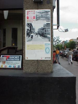
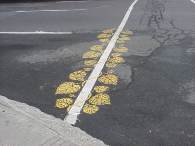
Picture one at the corner of Pine and Saint Laurent, if you look closely, you can see how it has absolutely nothing to do with anything, other than perhaps a fascination with one way signs.

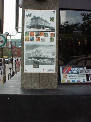
Picture two, Pine and Saint Laurent. This is my favorite one. It is place specific, very place specific. Pictures from the very spot where it is taken in 1930, 1980 and about a month ago (although why they needed to stick a "current" picture when all you gotta do is turn around, I don't know). Very Cool.

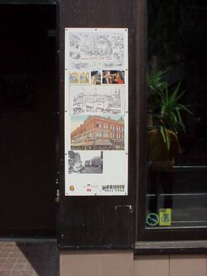
Another kick-ass poster. Again, place specific, dealing with what was on the spot in the past. They forgot about the Balmoral (which also burned down). Nice touch, adding the no-smoking sign.

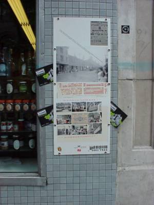
Now we get back to a more generic type of poster. The problems here are that it is about the Baxter block, which if you're looking at the poster is behind your back. Actually, most of the posters involve things that are out of your field of vision when looking at them. Maybe it is something like why European books always have the spine reading the wrong way. I wouldn't have thought it self-evident that I gotta look around after seeing a poster. I prefer things to be much more direct.

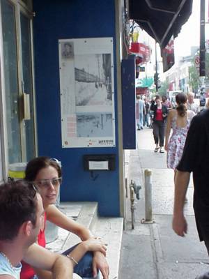
Outside Euro-Deli, something about snow, Emile Nelligan, and the Baxter block again. Sorta like summer reruns.

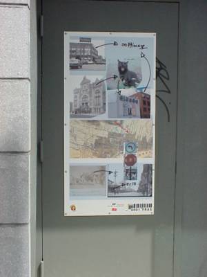
This one is just plain weird, they use a picture of one of Maclean's Stop Signs, from Saint Laurent and Milton (again, to your back when you're looking) but there is nothing there to make you aware that it is in fact from that corner. And now, with a little closer analysis, I realize that, yes it is place specific, but jeez! How many people are going to spend more than 30 seconds on any one poster?

More generic. Why there is the sign from the Main, I dunno.

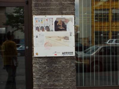
Corner of Rachel and Saint Laurent, picture one. Place specific, which is good. Way too many words, which is not so good.

Corner of Rachel and Saint Laurent, picture two. Place specific, which is good. Not too many words, which is also very good.

Something about there being an awful lot of Portuguese living in and around Saint Laurent. The historical photos 50 feet away in the window of the Caisse Pop are way better. The chicken and the church are down the block and around the corner, not even close to Saint Laurent.

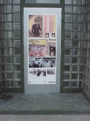
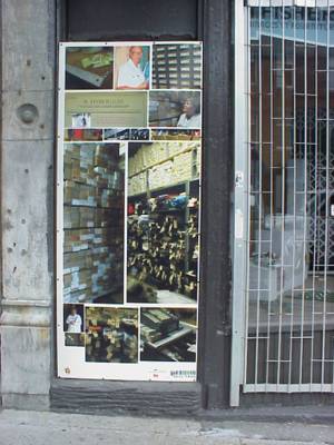
Now we get to the individual tribute posters, this one to Schreter's. Heck, I'd adore it if the city or the SDC kicked in $20,000 for an ad for the gallery, that would be very sweet.

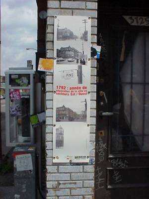
According to this poster, the most famous corner, is Saint Antoine and Saint Laurent. This poster is in between Marie-Ann and Mount Royal on Saint Laurent. Huh?

Place specific, good. Not many words, good, too. Unfortunately, right next store is a window display that does a way better job explaining the history at the corner of Mount Royal and Saint Laurent.

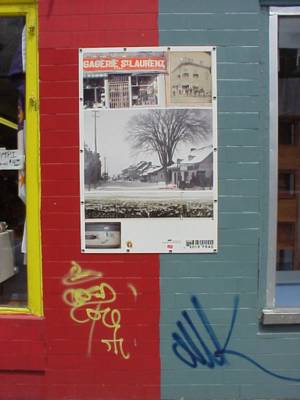
Obviously ATSA are federalists because they lean their art more towards the red side. This one shows exactly why I have an overall sensation of disappointment with the project. Yes, there's a picture of one of the businesses that occupied the spot where the poster is. But, in reality it isn't all that interesting. A luggage shop? Gimme a break. Then they add a winter scene from 100 years ago, complete with a "you are here" arrow, to take up space, but again, it isn't terribly compelling. And then they have that little picture lower left, huh? All I can guess is that they needed to have some blank space for all the logos. And what's up with the
Contact Image logo, like there aren't any photo labs on Saint Laurent? I thought the mandate of the SDC was to promote businesses on Saint Laurent, not one's on Gilford.

Another advertisement. Complete with a heart wrenching story. Welcome to my neighborhood.
It would have been nice if they had a map, with some explantions or stories, or something. Overall I get the sensation that this could have been so much more. Maybe Pierre and Annie will get another whack of cash to fix them up next year.


