


Stuff Seen - Art in the City
Howdy!
Ungraded due to way too many conflicts of interest. (I am good friends with the staff at Stewart Hall, I know a bunch of the artists exhibiting, one of the gallerists was on a jury that awarded me the only Canada Council grant I have ever received in my life, one of the gallerists dislikes me intensely, and I am certain that there's something in a closet somewhere with the third gallerist that I just can't remember.)
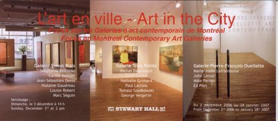
On Sunday I was quite nicely picked up and driven out to Stewart Hall in order to see their exhibit called 'Art in the City.' An exhibit based on the rosters of three of the more important galleries in Montreal. They were also having a conference with all the gallerists (or as I would call myself Gallery Guys and Gals, or as they would call them slightly further south Dealers) my comments on the conference are right now in the 'soon come' stage.
Anyhows, one of the things that I was quite struck by (of a bunch of things that I was struck by) was that I have always held as an assumption near and dear to my heart that any and all galleries tend to exhibit art that is, while not exactly the same, sufficiently similar that there is an obvious thread running through their choices of art and artists to exhibit and represent.
Well, Pierre-Francois Ouellete, of Pierre-Francois Ouelette Art Contemporain despite having the most coherently thought out plan as to which and what artists to represent (technical/New Media stuff) also had a bunch of really big (and wicked cool, too) Ed Pien paintings or drawings. Or more explicitly, when looking at a collection of artists represented by one gallery (any of the three galleries) my initial idea that there is some sort of thread was as wrong as wrong can be.
Looking around, I realized that pretty much everything that was from Simon Blais' gallery was beige - I don't know what it is about beige, but it is getting mighty popular. Last year I had a show here that was all beige. But beige no matter how popular it is currently does not make for anything approaching a consistent concept or idea. As it turns out, I also saw for the first time in my life some work by Marc Seguin that I liked! I had to pick my jaw up off the floor I was so surprised.
The exhibit was set up so that each gallery had their own section, although there were some spaces where there was overlap (imagine Stewart Hall as a Venn Diagram) Simon Blais and Jocelyne Aumont at the ends and Pierre Francois Ouellette in the middle. Down at Jocelyne Aumont's end it was equally tough to find a common thread, which proved to me that despite how old, fat and in the way I have become (don't even get me started on the gray hair!) I always need be able to learn something new, and recognize as quickly as possible when I am wrong. Ms. Aumont was the only gallerist who would not let me take any pictures, as a consequence I only have sort of fuzzy memories of a couple of pieces, and a list of artist names' and titles. From that all I can figure out is that most (but not all) of her artists have only two syllables in their last name.
But to get down to brass tacks - First I never ever like it when a gallery or curator takes more credit than the artist. In this exhibit it is completely debatable as to whether the gallerists or the artists are getting more credit (I did not have a tool to measure the size of the letters) but due to the nature of the show, I'm willing to let everyone have a free pass this time. Basically, since most of the folks who show up at Stewart Hall are not all that familiar with art made as recently as last Tuesday (ie Contemporary Canadian Art) that this was an attempt to bring everyone up to speed. As such it succeeds tremendously. There are three previous Prix Pierre Ayot laureates (and while I have some very serious and specific problems with the prize, how it is managed, how it is awarded, and what it is attempting to accomplish, it is meant to impress neophytes to Contemporary Canadian Art, and as such it does – one of the reasons why the show succeeds).
But instead of writing about prizes, galleries, or concepts about an exhibit, how about writing about the art? I'd seen Mike Patten's Palm Pilot drawings before (aka the Lost Thought series) and a friend of mine has participated in his group drawing thing that he is doing with the PDA. The Palm Pilot drawings are a bunch of blown up black pixels on white paper. I recognize the process is a significant part of his work and how there is a long and extremely logical line from which he is coming from. But... When I got my first computer, it came with a program called 'Paint' and I did the same gosh darn things - except I had 16 different colors. Mr. Patton was about 50% younger than he is now. One of the things I always say to the cliche about contemporary art of someone's kid being able to do that, is that their kid didn't do it first. Unfortunately, I did do it before Mr. Patten, and if you've been a long time reader, you'll remember this piece by Diamonster, using pretty much the same tools as Mr. Patten.
That all being said - he beat me to the punch with his green paint roller (aka Mondrian's Garden). It is a piece of his that I quite liked and enjoyed. Both pretty and conceptual at the same time, a one-two punch! In a nutshell, it is a big rectangular canvas with a large piece of green masking tape descending from the upper right side to the lower left side, where there is a paint roller on a broomstick that is wrapped with the same green masking tape. (extra bonus points if you can name the three footnotes that would have accompanied that previous sentence if I wrote like a standard issue art critic or art historian). Mondrain's Garden also served as a green foil for Mr. Pien's drawings. Pretty much black leaves on a very green background with a pink sketch hanging out having a grand old time. Nothing terribly brow furrowing,my guess would be that the new media stuff that Pierre Francois Ouellette likes to exhibit was that they were archival ink jet prints or something like that. There were way too many people there to talk to, and I forgot to ask for a list of the works, so as a consequence I'm gonna look sorta foolish as my notes don't tell me if something was acrylic paint, or a color inkjet print, or something else. Mea Culpa. [note: Joyce Millar, the director of the Stewart Hall Art Gallery saved my butt. She graciously forwarded a list of the works to me after the fact, and Mr. Pien's work is 'ink on 2-layered glassine paper.']
Continuing along with Pierre Francois Ouellette's roster of artists, John Latour had two different types of work, one type I was previously familiar with, and the other that I had never ever seen before. Basically in the type of work that I was unfamiliar with, Mr. Latour had taken some pages from some books that I assume had (or still did) hold some significance for him. He then proceeded to white out most of the words on the pages, leaving only one sorta surreal sentence left. Vaguely haiku-like. He wasn't much of a help when trying to get a handle on the whats and the whys of the piece, as the full and complete title of the piece is 'various works from an untitled series.' None of the sentences were sufficiently strong enough on their own to smack me upside the head, and as you might have guessed I did not write any down. Can you spell S-U-PE-R S-T-O-O-P-I-D? But making my own handle where there is none, I realized a little later on that Mr. Latour's work is very similar in style and concept to another Montreal artist I know. Sherwin Tija, and I figure at some point I should introduce Mr. Latour to Mr. Tija – another wicked cool local artist, author, performer, and possessor of more creativity in his little finger than any four people I know. I'd bet dollars to doughnuts that there would be some pretty cool collaborations that could happen.
Mr. Latour also had these cute crippled chairs and stools. A much deeper shade of brown than the biege of his book objects (there it is again). I could probably riff off for about 1,000 words on accessibility in art, and the sculptural differences between various congenital bone deformities. But how about I don't and we just leave it at that? ok?
My sincere apologies to Marie-Josee Laframboise, I liked her stuff, but as I've already written over 1,500 words and there are still 12 more artists who have work that I should write about, as a consequence she's getting the short end of the stick. Next time, ok? I promise.
Over in the Simon Blais section of the show, beyond there being an overwhelming beige presence, what struck me most were Marc Seguin's pieces. As I've said elsewhere and before, this was the first time I had ever seen anything by him that I actually liked. And then I was told that they were named after some terrorists that were wanted by the FBI or something like that. Nothing like a little gossip in order to whet the appetite, eh? My guess is that he used pictures of these supposed terrorists to paint (or perhaps transfer) their faces onto the canvas. He then added a female body in a fairly loud (or as loud as you can get in beige) print dress. The heads not really quite attached to the bodies. In a weird sort of way I got a big kick out of how light, airy, dainty, ghostly, and subtle they were.
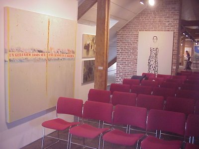
On the right hand side of the picture you can see a bad picture taken by me of one of M. Seguin's paintings. One of Louise Robert's pieces is on the right hand side of the photo. Same deal applies to both of them as it did to Mr. Pien. I should've written down what her paintings said. That way I could've sounded maybe half intelligent, instead of saying "I like." (umm, actually I take that back. With the Louise Robert paintings there ain't no way in heck I can avoid looking dumb. One is titled 78-292, and the other one is called 78-287. I wonder if they were made in 1978, and she was trying to do a painting every day of the year? October 14th & 19th, 1978 what happened?)
More apologies, but in an attempt to keep this from getting even more unwieldy than it already is, I'm going to cut it off rather abruptly before all of you go tl;dr on me. So, in a nutshell; Nathalie Grimard, Paul Lacroix and Clint Griffin were the artists who I mentioned in my notes as having work that I liked from Ms. Aumont's gallery.
As per normal, I would've hung things differently, but nobody asked me when they were hanging it, so I guess I'm going to have to live with it. I also was left wondering how each dealer gallerist chose the specific art and artists that they did, but obviously I'm going to have to save that question for later, and ask people in person.
The exhibit is up until the 28th of January. The address for Stewart Hall is: 176 Lakeshore, Pointe Claire. And if you want to speak to them, the phone number is (514) 630-1254

Ungraded due to way too many conflicts of interest. (I am good friends with the staff at Stewart Hall, I know a bunch of the artists exhibiting, one of the gallerists was on a jury that awarded me the only Canada Council grant I have ever received in my life, one of the gallerists dislikes me intensely, and I am certain that there's something in a closet somewhere with the third gallerist that I just can't remember.)
On Sunday I was quite nicely picked up and driven out to Stewart Hall in order to see their exhibit called 'Art in the City.' An exhibit based on the rosters of three of the more important galleries in Montreal. They were also having a conference with all the gallerists (or as I would call myself Gallery Guys and Gals, or as they would call them slightly further south Dealers) my comments on the conference are right now in the 'soon come' stage.
Anyhows, one of the things that I was quite struck by (of a bunch of things that I was struck by) was that I have always held as an assumption near and dear to my heart that any and all galleries tend to exhibit art that is, while not exactly the same, sufficiently similar that there is an obvious thread running through their choices of art and artists to exhibit and represent.
Well, Pierre-Francois Ouellete, of Pierre-Francois Ouelette Art Contemporain despite having the most coherently thought out plan as to which and what artists to represent (technical/New Media stuff) also had a bunch of really big (and wicked cool, too) Ed Pien paintings or drawings. Or more explicitly, when looking at a collection of artists represented by one gallery (any of the three galleries) my initial idea that there is some sort of thread was as wrong as wrong can be.
Looking around, I realized that pretty much everything that was from Simon Blais' gallery was beige - I don't know what it is about beige, but it is getting mighty popular. Last year I had a show here that was all beige. But beige no matter how popular it is currently does not make for anything approaching a consistent concept or idea. As it turns out, I also saw for the first time in my life some work by Marc Seguin that I liked! I had to pick my jaw up off the floor I was so surprised.
The exhibit was set up so that each gallery had their own section, although there were some spaces where there was overlap (imagine Stewart Hall as a Venn Diagram) Simon Blais and Jocelyne Aumont at the ends and Pierre Francois Ouellette in the middle. Down at Jocelyne Aumont's end it was equally tough to find a common thread, which proved to me that despite how old, fat and in the way I have become (don't even get me started on the gray hair!) I always need be able to learn something new, and recognize as quickly as possible when I am wrong. Ms. Aumont was the only gallerist who would not let me take any pictures, as a consequence I only have sort of fuzzy memories of a couple of pieces, and a list of artist names' and titles. From that all I can figure out is that most (but not all) of her artists have only two syllables in their last name.
But to get down to brass tacks - First I never ever like it when a gallery or curator takes more credit than the artist. In this exhibit it is completely debatable as to whether the gallerists or the artists are getting more credit (I did not have a tool to measure the size of the letters) but due to the nature of the show, I'm willing to let everyone have a free pass this time. Basically, since most of the folks who show up at Stewart Hall are not all that familiar with art made as recently as last Tuesday (ie Contemporary Canadian Art) that this was an attempt to bring everyone up to speed. As such it succeeds tremendously. There are three previous Prix Pierre Ayot laureates (and while I have some very serious and specific problems with the prize, how it is managed, how it is awarded, and what it is attempting to accomplish, it is meant to impress neophytes to Contemporary Canadian Art, and as such it does – one of the reasons why the show succeeds).
But instead of writing about prizes, galleries, or concepts about an exhibit, how about writing about the art? I'd seen Mike Patten's Palm Pilot drawings before (aka the Lost Thought series) and a friend of mine has participated in his group drawing thing that he is doing with the PDA. The Palm Pilot drawings are a bunch of blown up black pixels on white paper. I recognize the process is a significant part of his work and how there is a long and extremely logical line from which he is coming from. But... When I got my first computer, it came with a program called 'Paint' and I did the same gosh darn things - except I had 16 different colors. Mr. Patton was about 50% younger than he is now. One of the things I always say to the cliche about contemporary art of someone's kid being able to do that, is that their kid didn't do it first. Unfortunately, I did do it before Mr. Patten, and if you've been a long time reader, you'll remember this piece by Diamonster, using pretty much the same tools as Mr. Patten.
That all being said - he beat me to the punch with his green paint roller (aka Mondrian's Garden). It is a piece of his that I quite liked and enjoyed. Both pretty and conceptual at the same time, a one-two punch! In a nutshell, it is a big rectangular canvas with a large piece of green masking tape descending from the upper right side to the lower left side, where there is a paint roller on a broomstick that is wrapped with the same green masking tape. (extra bonus points if you can name the three footnotes that would have accompanied that previous sentence if I wrote like a standard issue art critic or art historian). Mondrain's Garden also served as a green foil for Mr. Pien's drawings. Pretty much black leaves on a very green background with a pink sketch hanging out having a grand old time. Nothing terribly brow furrowing,
Continuing along with Pierre Francois Ouellette's roster of artists, John Latour had two different types of work, one type I was previously familiar with, and the other that I had never ever seen before. Basically in the type of work that I was unfamiliar with, Mr. Latour had taken some pages from some books that I assume had (or still did) hold some significance for him. He then proceeded to white out most of the words on the pages, leaving only one sorta surreal sentence left. Vaguely haiku-like. He wasn't much of a help when trying to get a handle on the whats and the whys of the piece, as the full and complete title of the piece is 'various works from an untitled series.' None of the sentences were sufficiently strong enough on their own to smack me upside the head, and as you might have guessed I did not write any down. Can you spell S-U-PE-R S-T-O-O-P-I-D? But making my own handle where there is none, I realized a little later on that Mr. Latour's work is very similar in style and concept to another Montreal artist I know. Sherwin Tija, and I figure at some point I should introduce Mr. Latour to Mr. Tija – another wicked cool local artist, author, performer, and possessor of more creativity in his little finger than any four people I know. I'd bet dollars to doughnuts that there would be some pretty cool collaborations that could happen.
Mr. Latour also had these cute crippled chairs and stools. A much deeper shade of brown than the biege of his book objects (there it is again). I could probably riff off for about 1,000 words on accessibility in art, and the sculptural differences between various congenital bone deformities. But how about I don't and we just leave it at that? ok?
My sincere apologies to Marie-Josee Laframboise, I liked her stuff, but as I've already written over 1,500 words and there are still 12 more artists who have work that I should write about, as a consequence she's getting the short end of the stick. Next time, ok? I promise.
Over in the Simon Blais section of the show, beyond there being an overwhelming beige presence, what struck me most were Marc Seguin's pieces. As I've said elsewhere and before, this was the first time I had ever seen anything by him that I actually liked. And then I was told that they were named after some terrorists that were wanted by the FBI or something like that. Nothing like a little gossip in order to whet the appetite, eh? My guess is that he used pictures of these supposed terrorists to paint (or perhaps transfer) their faces onto the canvas. He then added a female body in a fairly loud (or as loud as you can get in beige) print dress. The heads not really quite attached to the bodies. In a weird sort of way I got a big kick out of how light, airy, dainty, ghostly, and subtle they were.

On the right hand side of the picture you can see a bad picture taken by me of one of M. Seguin's paintings. One of Louise Robert's pieces is on the right hand side of the photo. Same deal applies to both of them as it did to Mr. Pien. I should've written down what her paintings said. That way I could've sounded maybe half intelligent, instead of saying "I like." (umm, actually I take that back. With the Louise Robert paintings there ain't no way in heck I can avoid looking dumb. One is titled 78-292, and the other one is called 78-287. I wonder if they were made in 1978, and she was trying to do a painting every day of the year? October 14th & 19th, 1978 what happened?)
More apologies, but in an attempt to keep this from getting even more unwieldy than it already is, I'm going to cut it off rather abruptly before all of you go tl;dr on me. So, in a nutshell; Nathalie Grimard, Paul Lacroix and Clint Griffin were the artists who I mentioned in my notes as having work that I liked from Ms. Aumont's gallery.
As per normal, I would've hung things differently, but nobody asked me when they were hanging it, so I guess I'm going to have to live with it. I also was left wondering how each dealer gallerist chose the specific art and artists that they did, but obviously I'm going to have to save that question for later, and ask people in person.
The exhibit is up until the 28th of January. The address for Stewart Hall is: 176 Lakeshore, Pointe Claire. And if you want to speak to them, the phone number is (514) 630-1254
posted by Zeke's, the Montreal Art Gallery on 18.1.07
![]()
![]()
<< Home