


Stuff Seen - Pascal Grandmaison
Howdy!
C+
Back in June I went to the Musee d'Art Contemporain to see Pascal Grandmaison's start turn. I wasn't impressed. It wasn't horrifically bad, nor was it mind boggling great. It was just sort of there. For the most part some fairly large, fairly plain pictures (does anyone know what a “light jet print” is?). The catalog has a bunch of pictures and some big words – I haven't read it yet, because I prefer to write what I think about the show before I contaminate my memory with someone else's thoughts.
Three videos, 18 pictures, all for the most part dealing with an edge. Unfortunately they aren't edgy, more like a statement of fact, you know those vaguely modernist or minimalist picture frames (Ikea RIBBA) that are designed just to make you glom onto the idea that the picture has finshed.
As with most of the museum exhibitions here in town, the sound reverberated much further from the piece (in this case videos) than I felt it should, I can't quite understand. A throbbing bass line emanating from that sorry ass excuse for a tricked out car which then causes all the parked cars' alarms to ring out is at least comprehensible when you see that the driver is some 18-year old begging for attention. I've already committed to paying attention when I walk in the freakin' museum, I don't need individual pieces screaming out at me when I am no longer in eyeshot.
For whatever reason let's start with his video Diamond. 8 minutes and 40 seconds designed to make the viewer go away faster than 8 minutes and 39 seconds. There are long black scenes – what are you supposed to do when there is nothing on the screen? You sorta wander off to see the next piece, right? Especially when the way it is presented is as something you're supposed to only glimpse while passing. If they (the artist, the curator, the museum, whoever) want you to watch the entire video, then the entry and exit from the place to see the video should have whatever you're supposed to sit on in between. If you make the path from the entry to the exit a straight line, and then present a video that has long stretches of nothing on the screen don't be surprised if people walk right by it. I wrote in my notes “Longest 8:40 I've ever seen.”
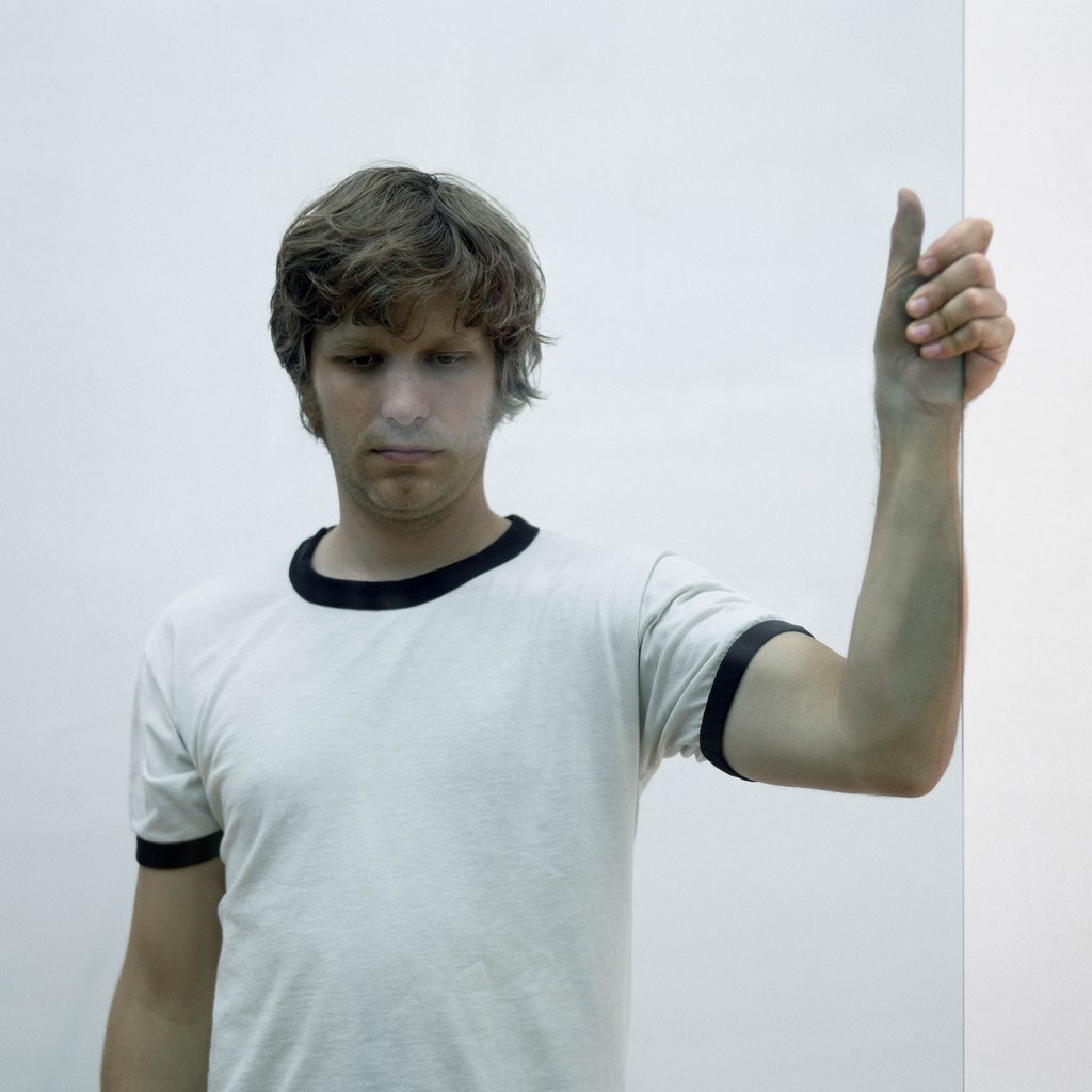
Furthering my idea that M. Grandmaison doesn't give two hoots about his audience or the people who go look at his work is that in the second video, called My Shadow, he makes a motion with his arm that is dangerously close to the Umbrella Gesture. Although I don't know how many people in his audience are Italian. On the positive side I got something written down that says “nice shirt.”
Then we get to the third video, called Air (although in reality there are a whole whack of pictures you gotta look at to get to the third video). As with all his videos, the background music or soundtrack is not done as well as it could be. I don't know if this is a museum technical problem (sorry we just don't have the equipment) or if this is an artist technical problem (I want this equipment, and will accept no substitutes). Most likely it is a little bit of both, but if you're going to add sound to an art video you should pay attention to how it is played back.
While everyone and everything says that in the video Air, it is M. Grandmaison's chest that is going up and down, it looks to me more like his arm. Whatever. Basically there's a bunch of sort of black (more like a hairy gray) stuff that moves up and down against a white background. The hairy gray never quite makes it all the way to the bottom and off the screen, nor does it ever make it to the top. What you follow as you watch is the edge between the hairy gray and the white. That edge can also be interpreted as a wall, you know one of those things that makes neighbors good? I'm certain that there is a specific reason why he stuck in the eye and face, but I can't figure out anyone that makes sense to me. I would've cut them out (or not filmed them) and called the whole sucker an endless loop.
Now what do you do with an artist who deliberately makes it real tough (or impossible) to approach the work they make? If you're 18 years old and alienated, and someone has said “it's cool” you soak it up like a sponge, wait 20 years and then tell everyone you know you were there then. I guess I'm going to have to go back and see M. Grandmaison's show once more to see if there are a disproportionate number of alienated 18 years olds spending inordinate amounts of time watching his videos. Somehow I don't think so.
Now that we got the videos out of the way (besides myself, how many other people do you think have watched all 28 minutes and 18 seconds of M. Grandmaison's videos?) we can go onto the pictures.
The Glass series of pictures (currently showing at the Musee des beaux arts, Marche Bonsecours, and Cafe Cherier as well as the MACM) furthers the idea that M. Grandmaison wants to distance and alienate his audience. Normally if you're taking a picture of someone, a portrait if you will, you do not put a barrier in between them and the camera. Even if that barrier is transparent, it still pushes the audience further away than they need to be. I'm not quite certain why M. Grandmaison wants to push his viewers away, but he sure as shootin' doesn't want them getting close.

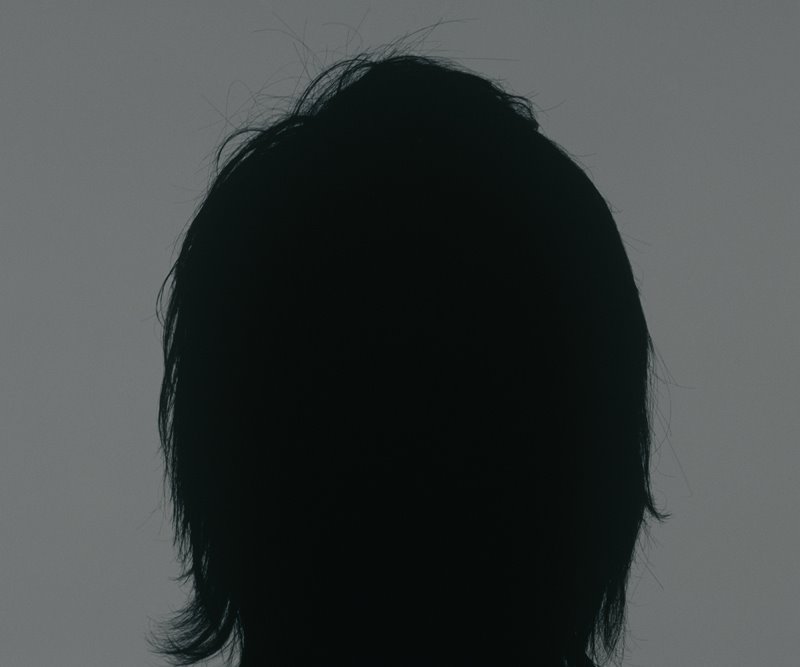
In the Ouverture series he continues on this theme by photographing the back of everyone's head, and then futzing around with the contrast settings so that each of the pictures is a silouette on a gray-ish brown background. Once again that edge that puts up a barier so that the viewer cannot get anywhere near the image.

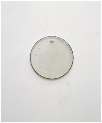
In the Manner and Upside Land series of pix, M. Gransmaison stops with the pictures of people, and goes for inanimate objects, specifically shoes and drum heads. I was going to try and concoct a story about the drum heads (the Manner series) where I would be able to prove by his choice of skins that M. Grandmaison had, earlier in his life been a drummer in a Loverboy tribute band. However, by the time I was halfway through the story, I realized I had made a mistake and in fact it was Chilliwack and not Loverboy who had performed the song “My Girl (Gone, Gone, Gone)” which would have tied together nicely as M. Grandmaison seems to be pushing everything away. No such luck.
Which leaves us with the sneakers... the less said the better.
PS: After the fact, I just finished reading the catalog. I'm confused as to why Reid Shier did not refer to a single piece that was in the exhibit. And I'm not altogether too happy to discover that under the title of "textes dans catalogues et livres' the catalog for this here show takes up three lines, because there are three different authors. I also don't quite understand how they could have missed him taking part in Sound + Vision at the Musee des Beaux Arts, and not included it in his CV, and finally I am also quite excited to be listed in forthcoming Pascal Grandmaison CVs since he decides to list this 574 word article by by Nicolas Mavrikakis in his CV (which in fact uses six words to deal with his work) and at last count, I was somewhere up around 1,200 words, all dealing with his art.
C+
Back in June I went to the Musee d'Art Contemporain to see Pascal Grandmaison's start turn. I wasn't impressed. It wasn't horrifically bad, nor was it mind boggling great. It was just sort of there. For the most part some fairly large, fairly plain pictures (does anyone know what a “light jet print” is?). The catalog has a bunch of pictures and some big words – I haven't read it yet, because I prefer to write what I think about the show before I contaminate my memory with someone else's thoughts.
Three videos, 18 pictures, all for the most part dealing with an edge. Unfortunately they aren't edgy, more like a statement of fact, you know those vaguely modernist or minimalist picture frames (Ikea RIBBA) that are designed just to make you glom onto the idea that the picture has finshed.
As with most of the museum exhibitions here in town, the sound reverberated much further from the piece (in this case videos) than I felt it should, I can't quite understand. A throbbing bass line emanating from that sorry ass excuse for a tricked out car which then causes all the parked cars' alarms to ring out is at least comprehensible when you see that the driver is some 18-year old begging for attention. I've already committed to paying attention when I walk in the freakin' museum, I don't need individual pieces screaming out at me when I am no longer in eyeshot.
For whatever reason let's start with his video Diamond. 8 minutes and 40 seconds designed to make the viewer go away faster than 8 minutes and 39 seconds. There are long black scenes – what are you supposed to do when there is nothing on the screen? You sorta wander off to see the next piece, right? Especially when the way it is presented is as something you're supposed to only glimpse while passing. If they (the artist, the curator, the museum, whoever) want you to watch the entire video, then the entry and exit from the place to see the video should have whatever you're supposed to sit on in between. If you make the path from the entry to the exit a straight line, and then present a video that has long stretches of nothing on the screen don't be surprised if people walk right by it. I wrote in my notes “Longest 8:40 I've ever seen.”
Furthering my idea that M. Grandmaison doesn't give two hoots about his audience or the people who go look at his work is that in the second video, called My Shadow, he makes a motion with his arm that is dangerously close to the Umbrella Gesture. Although I don't know how many people in his audience are Italian. On the positive side I got something written down that says “nice shirt.”
Then we get to the third video, called Air (although in reality there are a whole whack of pictures you gotta look at to get to the third video). As with all his videos, the background music or soundtrack is not done as well as it could be. I don't know if this is a museum technical problem (sorry we just don't have the equipment) or if this is an artist technical problem (I want this equipment, and will accept no substitutes). Most likely it is a little bit of both, but if you're going to add sound to an art video you should pay attention to how it is played back.
While everyone and everything says that in the video Air, it is M. Grandmaison's chest that is going up and down, it looks to me more like his arm. Whatever. Basically there's a bunch of sort of black (more like a hairy gray) stuff that moves up and down against a white background. The hairy gray never quite makes it all the way to the bottom and off the screen, nor does it ever make it to the top. What you follow as you watch is the edge between the hairy gray and the white. That edge can also be interpreted as a wall, you know one of those things that makes neighbors good? I'm certain that there is a specific reason why he stuck in the eye and face, but I can't figure out anyone that makes sense to me. I would've cut them out (or not filmed them) and called the whole sucker an endless loop.
Now what do you do with an artist who deliberately makes it real tough (or impossible) to approach the work they make? If you're 18 years old and alienated, and someone has said “it's cool” you soak it up like a sponge, wait 20 years and then tell everyone you know you were there then. I guess I'm going to have to go back and see M. Grandmaison's show once more to see if there are a disproportionate number of alienated 18 years olds spending inordinate amounts of time watching his videos. Somehow I don't think so.
Now that we got the videos out of the way (besides myself, how many other people do you think have watched all 28 minutes and 18 seconds of M. Grandmaison's videos?) we can go onto the pictures.
The Glass series of pictures (currently showing at the Musee des beaux arts, Marche Bonsecours, and Cafe Cherier as well as the MACM) furthers the idea that M. Grandmaison wants to distance and alienate his audience. Normally if you're taking a picture of someone, a portrait if you will, you do not put a barrier in between them and the camera. Even if that barrier is transparent, it still pushes the audience further away than they need to be. I'm not quite certain why M. Grandmaison wants to push his viewers away, but he sure as shootin' doesn't want them getting close.
In the Ouverture series he continues on this theme by photographing the back of everyone's head, and then futzing around with the contrast settings so that each of the pictures is a silouette on a gray-ish brown background. Once again that edge that puts up a barier so that the viewer cannot get anywhere near the image.
In the Manner and Upside Land series of pix, M. Gransmaison stops with the pictures of people, and goes for inanimate objects, specifically shoes and drum heads. I was going to try and concoct a story about the drum heads (the Manner series) where I would be able to prove by his choice of skins that M. Grandmaison had, earlier in his life been a drummer in a Loverboy tribute band. However, by the time I was halfway through the story, I realized I had made a mistake and in fact it was Chilliwack and not Loverboy who had performed the song “My Girl (Gone, Gone, Gone)” which would have tied together nicely as M. Grandmaison seems to be pushing everything away. No such luck.

Which leaves us with the sneakers... the less said the better.
PS: After the fact, I just finished reading the catalog. I'm confused as to why Reid Shier did not refer to a single piece that was in the exhibit. And I'm not altogether too happy to discover that under the title of "textes dans catalogues et livres' the catalog for this here show takes up three lines, because there are three different authors. I also don't quite understand how they could have missed him taking part in Sound + Vision at the Musee des Beaux Arts, and not included it in his CV, and finally I am also quite excited to be listed in forthcoming Pascal Grandmaison CVs since he decides to list this 574 word article by by Nicolas Mavrikakis in his CV (which in fact uses six words to deal with his work) and at last count, I was somewhere up around 1,200 words, all dealing with his art.
posted by Zeke's, the Montreal Art Gallery on 3.8.06
![]()
![]()
<< Home