


Edwin Holgate at the Musée des Beaux Arts
Howdy!
I just got back from the presser for the Musée des Beaux Arts latest and greatest exhibit, a retrospective on the one, the only Edwin Holgate. To get the easy stuff out of the way first, I'd give the exhibit a B+, a strong B+, but a B+ none the less. As with any exhibit it is way easy to complain, criticize and condemn, and believe you me, all my questions will be asked before I finish typing this sucker.
But before I get into the stuff that you're gonna think is catty, believe it or not I like the show. Before getting the invite, I wouldn't have been able to recognize an Edwin Holgate painting from a Lionel LeMoine FitzGerald painting, and I would have thought that the Beaver Hall Hill group was some insurance company that had offices in the Banque nationale building. Afterwards, though, I am full of learnin'!
Personally, I got a kick out of Mr. Holgate's portraits, and his woodcuts/engravings/prints rock like nobody's business. I wasn't able to get a gander at the catalogue, but I hope that the woodcuts are all reproduced. As per normal, I don't know much about how the suckers are made, but Mr. Holgate seems to know what he was doing. When he was making 'em. Given that an awful lot is made about the time he spent out west making pictures of the Gitxsan on the Skeena river in British Colombia (it gets the same amount of space as everything he did from 1946 until 1977) I wonder how much their carving techniques influenced him. I might have to go back and have a closer look at them in a chronological fashion to see if I can't figure something out.
In the room dedicated to the Prints and Illustrated books, I got quite confused over a couple of small things, that don't detract from the exhibit, but made me raise an eyebrow. First, there are these two prints, both entitled "The Bathers," one is with black ink, the other is with a brown or tan ink. They are right next to each other, and to my untrained eye I couldn't see a darn thing different between 'em, except of course the color. Some other small points that I saw, in my brief run through was that in the Skeena River room, they had three other prints, I think that two of the tags got messed up, 'cuz on the piece called Totem Poles No. 1 it says "color woodprint" or something like that, but there ain't no color that I could see (unless I recently became colorblind) however, the number 2 does have some color, but it is merely labeled "woodprint." My best guess is that someone should go back over the tags and proof 'em.
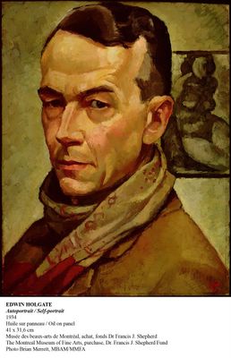
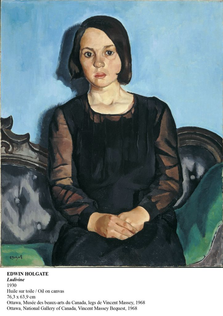
By far and away the best room, despite my preference for the prints, is the "Landscapes, Nudes and Portraits" all because of the portraits. I realized that I'm not a big fan of his landscapes, on a superficial level I found them all to be just a little too blurry, rounded, not precise enough or something. And there really wasn't anything jumping out at me on the wall text trying to explain the hows and the whys. Which then led me to believe that one of the reasons why I like the portraits is that for the most part the backgrounds on them is rather plain. Or on those that don't have plain backgrounds the faces themselves are so freakin' strong and in your face that unless I forced myself to focus and concentrate on them I didn't pay them no mind.
One of the portraits, and prominently displayed, too I might add, is of Jean Chauvin. It made me laugh, because strung out on the tops of the walls all throughout the exhibit are quotes, used like soundbites that I can only think are there in order to impress you with how important Mr. Holgate is, was and is going to be. As with most wall text, sometimes I look, sometimes I read, and most of the time I ignore. But I did read one (unfortunately I didn't write it down) that was by the very same Jean Chauvin, and it was very complimentary of Mr, Holgate's work. What you gotta realize is that M. Chauvin was one of the art critics in Montreal at the time, and the folk at the museum led me to believe that he was fairly influential, too. I like the idea (I don't know if it true or not) that Mr. Holgate was trying to curry favor with an influential art critic by offering to paint his portrait. Seems like ethics in the art world 70 years ago were as malleable as they are today. I'm going to have to remember to suggest to all my painter friends that they offer to do portraits of Nicolas Mavrikakis ASAP.
Beyond that the other things that sorta jumped out at me, were:
If you look closely at the painting "Wet Day - 1943" your standard issue military painting, you can see what I would guess would be the first known tag by local artist Zilon. I didn't know that Zilon was so old.
In the Prints and Illustrated Books section there's one piece that's a wash on paper, it sorta stands out like a sore thumb being next to all the woodcuts.
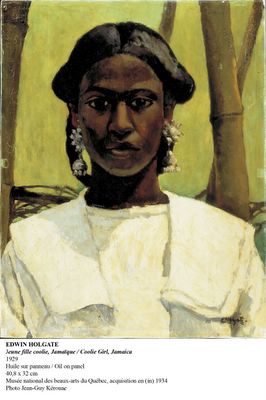
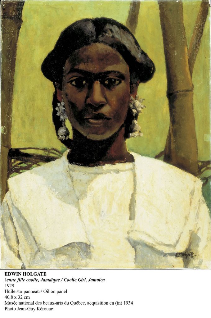
On the tag for the Coolie Girl, Brian Foss and Rosalind Pepall impose a late 20th century notion about the subject, going all misty eyed about how Mr. Holgate elevates the subject by painting her looking straight at the viewer, sort of apologizing for the racism at the time. From my seat, ignoring the title, given the nature of the earrings and the apparent quality of her dress, I would strongly question what they say about the nature of her supposed status. For what it is worth, Marcus Garvey founded the UNIA in Jamaica in 1914 (a full 15 years before Mr. Holgate painted Coolie Girl) and while I can't vouch for having first hand knowledge of what conditions were like in Jamaica at the time, my best guess would be that they were entirely different, and slightly better than in the United States at the time. As coolie in it's dictionary definition means an Indian or Chinese unskilled laborer, and she as shootin' doesn't look like she's from either place, I would imagine that Mr. Holgate used the term "coolie" to apply to anybody who's skin was darker than his irregardless of what they actually did in real life. Can you imagine washing floors, or cooking over a hot stove with earrings like that?
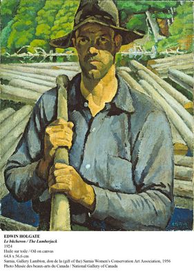
And while for the most part Christiane Michaud designed a very nice exhibition, I gotta point out that by placing the pen (or maybe pencil) sketches for the Fire Ranger and The Lumberjack, on an entirely different wall (and fairly far away) from the portraits of the Fire Ranger and the Lumberjack she almost made me miss 'em. If she could put two copies of The Bathers side-by-side, why couldn't she have done that with these? I'm certain it would have been eye popping.
So there you have it in a sort of large nutshell. Overall the exhibit rocks. I'm looking forward to having an opportunity to check the catalogue out. As I went to the presser with Sari Mandel, Jacquline Mabrey, and Rina Zigler (aka The Amazing Interns) anything they have to say about the exhibit I will post here as well.
[Update, May 28, 2005: Jacquline Mabey on Edwin Holgate]
[Update, June 4, 2005: Sari Mandel on Edwin Holgate]
I just got back from the presser for the Musée des Beaux Arts latest and greatest exhibit, a retrospective on the one, the only Edwin Holgate. To get the easy stuff out of the way first, I'd give the exhibit a B+, a strong B+, but a B+ none the less. As with any exhibit it is way easy to complain, criticize and condemn, and believe you me, all my questions will be asked before I finish typing this sucker.

But before I get into the stuff that you're gonna think is catty, believe it or not I like the show. Before getting the invite, I wouldn't have been able to recognize an Edwin Holgate painting from a Lionel LeMoine FitzGerald painting, and I would have thought that the Beaver Hall Hill group was some insurance company that had offices in the Banque nationale building. Afterwards, though, I am full of learnin'!
Personally, I got a kick out of Mr. Holgate's portraits, and his woodcuts/engravings/prints rock like nobody's business. I wasn't able to get a gander at the catalogue, but I hope that the woodcuts are all reproduced. As per normal, I don't know much about how the suckers are made, but Mr. Holgate seems to know what he was doing. When he was making 'em. Given that an awful lot is made about the time he spent out west making pictures of the Gitxsan on the Skeena river in British Colombia (it gets the same amount of space as everything he did from 1946 until 1977) I wonder how much their carving techniques influenced him. I might have to go back and have a closer look at them in a chronological fashion to see if I can't figure something out.
In the room dedicated to the Prints and Illustrated books, I got quite confused over a couple of small things, that don't detract from the exhibit, but made me raise an eyebrow. First, there are these two prints, both entitled "The Bathers," one is with black ink, the other is with a brown or tan ink. They are right next to each other, and to my untrained eye I couldn't see a darn thing different between 'em, except of course the color. Some other small points that I saw, in my brief run through was that in the Skeena River room, they had three other prints, I think that two of the tags got messed up, 'cuz on the piece called Totem Poles No. 1 it says "color woodprint" or something like that, but there ain't no color that I could see (unless I recently became colorblind) however, the number 2 does have some color, but it is merely labeled "woodprint." My best guess is that someone should go back over the tags and proof 'em.
By far and away the best room, despite my preference for the prints, is the "Landscapes, Nudes and Portraits" all because of the portraits. I realized that I'm not a big fan of his landscapes, on a superficial level I found them all to be just a little too blurry, rounded, not precise enough or something. And there really wasn't anything jumping out at me on the wall text trying to explain the hows and the whys. Which then led me to believe that one of the reasons why I like the portraits is that for the most part the backgrounds on them is rather plain. Or on those that don't have plain backgrounds the faces themselves are so freakin' strong and in your face that unless I forced myself to focus and concentrate on them I didn't pay them no mind.

One of the portraits, and prominently displayed, too I might add, is of Jean Chauvin. It made me laugh, because strung out on the tops of the walls all throughout the exhibit are quotes, used like soundbites that I can only think are there in order to impress you with how important Mr. Holgate is, was and is going to be. As with most wall text, sometimes I look, sometimes I read, and most of the time I ignore. But I did read one (unfortunately I didn't write it down) that was by the very same Jean Chauvin, and it was very complimentary of Mr, Holgate's work. What you gotta realize is that M. Chauvin was one of the art critics in Montreal at the time, and the folk at the museum led me to believe that he was fairly influential, too. I like the idea (I don't know if it true or not) that Mr. Holgate was trying to curry favor with an influential art critic by offering to paint his portrait. Seems like ethics in the art world 70 years ago were as malleable as they are today. I'm going to have to remember to suggest to all my painter friends that they offer to do portraits of Nicolas Mavrikakis ASAP.
Beyond that the other things that sorta jumped out at me, were:
If you look closely at the painting "Wet Day - 1943" your standard issue military painting, you can see what I would guess would be the first known tag by local artist Zilon. I didn't know that Zilon was so old.
In the Prints and Illustrated Books section there's one piece that's a wash on paper, it sorta stands out like a sore thumb being next to all the woodcuts.
On the tag for the Coolie Girl, Brian Foss and Rosalind Pepall impose a late 20th century notion about the subject, going all misty eyed about how Mr. Holgate elevates the subject by painting her looking straight at the viewer, sort of apologizing for the racism at the time. From my seat, ignoring the title, given the nature of the earrings and the apparent quality of her dress, I would strongly question what they say about the nature of her supposed status. For what it is worth, Marcus Garvey founded the UNIA in Jamaica in 1914 (a full 15 years before Mr. Holgate painted Coolie Girl) and while I can't vouch for having first hand knowledge of what conditions were like in Jamaica at the time, my best guess would be that they were entirely different, and slightly better than in the United States at the time. As coolie in it's dictionary definition means an Indian or Chinese unskilled laborer, and she as shootin' doesn't look like she's from either place, I would imagine that Mr. Holgate used the term "coolie" to apply to anybody who's skin was darker than his irregardless of what they actually did in real life. Can you imagine washing floors, or cooking over a hot stove with earrings like that?
And while for the most part Christiane Michaud designed a very nice exhibition, I gotta point out that by placing the pen (or maybe pencil) sketches for the Fire Ranger and The Lumberjack, on an entirely different wall (and fairly far away) from the portraits of the Fire Ranger and the Lumberjack she almost made me miss 'em. If she could put two copies of The Bathers side-by-side, why couldn't she have done that with these? I'm certain it would have been eye popping.
So there you have it in a sort of large nutshell. Overall the exhibit rocks. I'm looking forward to having an opportunity to check the catalogue out. As I went to the presser with Sari Mandel, Jacquline Mabrey, and Rina Zigler (aka The Amazing Interns) anything they have to say about the exhibit I will post here as well.
[Update, May 28, 2005: Jacquline Mabey on Edwin Holgate]
[Update, June 4, 2005: Sari Mandel on Edwin Holgate]
posted by Zeke's, the Montreal Art Gallery on 24.5.05
![]()
![]()
<< Home